This actually brings up a very good issue that most will miss (at least that’s been my experience)…
When getting a logo created - you SHOULD not only get a full color (regardless of whether spot or process) logo, but also a Black and White or 1-Color logo for use in other mediums. I also think you should, at the very minimum, get that black and white logo in a vector file format such as .ai, .eps, or .cdr so you can send that to vendors for things like signs, decals, promotional materials, etc. Having jpg and png formats in various sizes for online purposes of both logos should be part of that package as well.
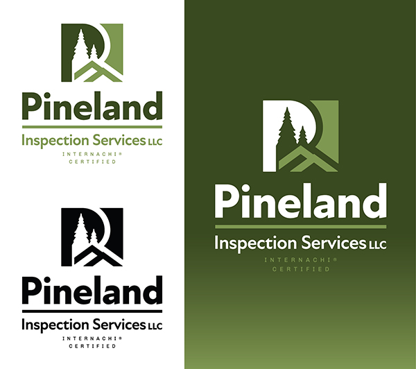
Incidentally, I also like the presentation of these logos - two copies on a white background, and a copy on a gradient colored background. I believe this approach shows off the logo in a variety of use scenarios quite nicely.