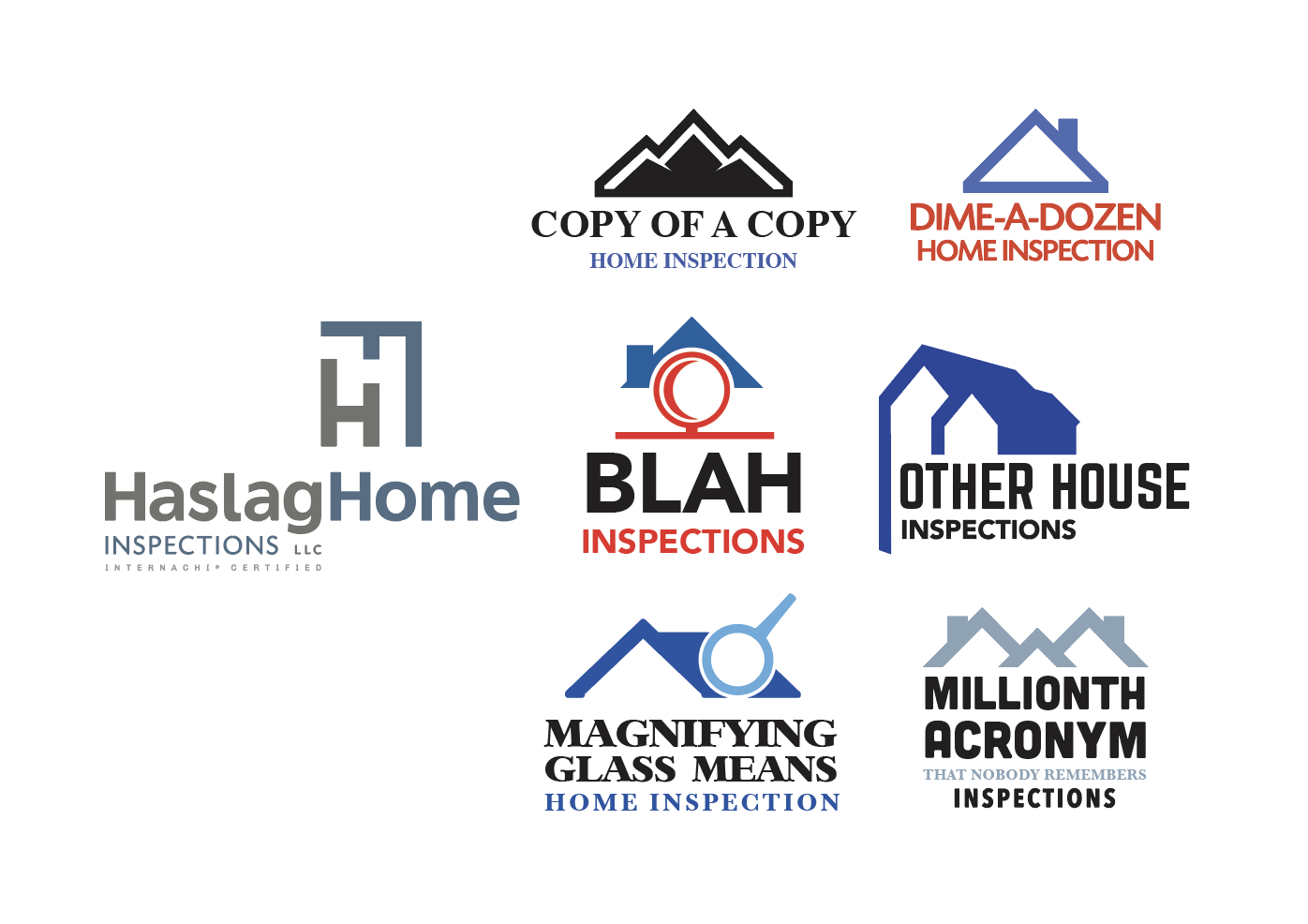
“When competing with other businesses that offer the same services, however, it’s easy to fall into the trap of adopting graphical characteristics for your logo that are similar to your competitors’. This can be called logo camouflage. A predictable logo makes your company blend in to a sea of similar logos.”
I’d like to know when it comes to inspectors who choose an InterNACHi designed logo vs those who do not choose an InterNACHI logo, how many are still in business one year later? Three years? Five years later?
What metrics and research do you have to show that using an InterNACHi designed logo produces superior results? More revenue? More inspections?
Is there any hard evidence to back up the numbers?
A lot of it is intuitive. Home inspectors have to work particularly hard on marketing since real estate agents happen to be in the marketing business and both recognize and appreciate good marketing (more business).
Home inspectors have to look professional if they want to command higher fees (more money).
And the big one… unlike other professions, your printed marketing material is a sneak preview of the coming attraction, that being your printed report. If your printed marketing material is weak, people will assume your report won’t be much better. The reverse is true as well.
But back to Ian’s questions: A simplistic correlation is impossible to derive because your logo is only a part of success. For example, if you put the world’s best transmission in a junky car with a cheap engine and worn-out tires… you ain’t winning any races. A logo, although the cornerstone of your marketing, is only one part of your entire success machine. I’ll point to a real life example: InterNACHI. InterNACHI didn’t become so successful because it did any ONE thing really well. Success is almost always based not on one factor, but rather synergy.
Real life example. There are tons of realties in my area. One of them is named Merry Fox, their logo is a small fox icon. Why do I remember that? It is not information that I need at all, but the name and the image stuck, so if someone asks me for the name of a local realty I will remember one, not because I worked with them, but because of a different name and a different image. The goal of a logo is just to stand out. If you do terrible work a memorable logo will also make it easy to remember who not to hire, but if you want to do your job well, why not use an additional tool? If you can get hired for doing your job well and because you have a logo that just sticks out in someone’s mind, why not have both things working for you instead of only one thing?
There is but it’s not 100% direct. Although a poorly-designed logo will in itself contribute to failure, there are also other related factors. Let me explain. The inspector, with no design background, who has his wife create some god-awful logo on her inkjet printer is ALSO LIKELY to be the type of inspector who doesn’t do anything else professionally in his career.
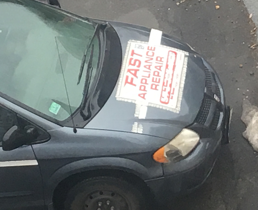
I took this photo from the window of the place that I work one day because it was hilarious. Sometimes the way that you choose to market speaks volumes about the type of job that you are going to do. I am guessing that the appliance repair here is “FAST” because there is lots of duct tape involved. If you want to free up your schedule duct tape a sign to the hood of your car.