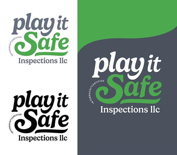
Sometimes the best route for a logo is a word mark. A word mark logo uses only the style of the font and colors to represent the company, no images. When the name of a company does not easily lend itself to an obvious straightforward image, a word mark design can be a good solution. In this logo, the style of the font and the colors convey the concept without using an image. The rounded, soft feel of the font is friendly while the green shift reinforces the word “Safe” like a green light. The upside of this approach is that nobody will miss this company name trying to figure out an image. In a logo, the most important part of your design is the clarity of your company name. If I cannot read your name in your logo, I can’t hire you. One of the quickest ways to get into trouble with a logo is by having an overly complicated image that distracts from, rather than reinforcing your company name. Always make sure that the image that you are using makes sense with the primary part of your company name (in this case “Play it Safe”) if the image isn’t reinforcing those words, it might just be preventing people from reading your name quickly and easily. This is also why the name of a company can make or break a logo, when starting a company, be intentional about thinking through the name.
I wouldn’t buy a home without an inspection, so why try to set up a design all on your own without professional support?
For more info on logos go here: Marketing for Inspectors: Questions to Help Think Through a Good Logo - InterNACHI® and here: Redesigning Bad Home Inspection Logos
Have your marketing professionally designed by the InterNACHI design team. The design services are free. Place your custom print order here:
http://printservices.nachi.org/
Marketing contact: jessica@internachi.org